Design System
The live token, theme, and material system this site runs on, shown proving itself.
← Back to WorkThe case
Problem
Four sections, one visual identity each (Work, Prateek OS, Creator, Personal). Left alone, that drifts: a stray hex here, a one-off spacing value there, and nothing lines up anymore.
What I built
Three token layers (primitive scales, semantic meaning, component and theme bindings) that every page reads from directly, a theme scope that rebinds only the semantic layer per section, and two build gates that reject a raw colour or off-scale type size before it ships.
Why it matters
The same discipline as type-checking, applied to visual consistency: the rules live in code, and CI enforces them.
Result
One semantic token set behind all four themes. This page is built entirely from the production tokens and components, so a regression here is a regression you can see.
System architecture
One idea, stated once: three layers, each consuming only the one below it. A page never reaches past the semantic layer; a theme scope only ever rebinds semantic tokens.
- 1Primitive
Raw scales. Never themed, never read by a component.
--neutral-900--space-6--radius-lg--duration-base--steel-400 - 2Semantic
Meaning. The only layer a page or component reads.
--surface-raised--text-primary--accent--border-strong--section-gap - 3Component + theme
Narrow bindings, plus four scopes that rebind a few semantic tokens each.
--glass-tint--nav-text.theme-os.theme-personal
Two build gates keep it honest: lint:css (Stylelint) andcheck:tokens (a Node audit) both reject a raw colour or an off-scalefont-size anywhere outside global.css.
Themes & materials
A theme does more than swap the palette. The specimen below is the same markup and copy four times over, so every visible difference comes purely from the semantic rebind. The line under each card names what that scope also binds beyond colour.
Work
Identical block, themed by scope
Same structure and same copy in every card. Surface, the three text weights, the accent and the border all come from this scope.
Muted supporting lineDim caption lineSteel accent. Clean dark surface, no grain.
Prateek OS
Identical block, themed by scope
Same structure and same copy in every card. Surface, the three text weights, the accent and the border all come from this scope.
Muted supporting lineDim caption lineRed accent. Drives the sticky system diagram; steel/red technical atmosphere.
Creator
Identical block, themed by scope
Same structure and same copy in every card. Surface, the three text weights, the accent and the border all come from this scope.
Muted supporting lineDim caption lineRed accent. Film-grain body material, editorial serif headings, red ambient wash.
Personal
Identical block, themed by scope
Same structure and same copy in every card. Surface, the three text weights, the accent and the border all come from this scope.
Muted supporting lineDim caption lineRestrained warm accent. Full re-skin: archival-stock surfaces, warm ink hierarchy, paper grain, serif headings, dark selection.
The scope drives the palette, the contrast inspector, and the material specimen below.
Semantic palette, resolved under the scope
--surface-page --surface-page-elevated --surface-raised --surface-raised-2 --surface-raised-3 --text-primary --text-muted --text-dim --accent --border-default --border-strong --glass-tint The frosted-glass material
The exact .glass material the production dock uses, laid across a bright band, a dark band, and a line of readable text so the blur, saturation, tint and edge are all visible at once. Above and below the bar is the same content un-glassed, for comparison. Switch the scope to Personal to see it rebind to archival-stock glass.
prefers-reduced-transparency: reduce rebinds this same material to a near-opaque tint with the blur removed; prefers-contrast: more sharpens its edge. Both are token-level changes in global.css, so the dock, its mobile flyout, and the mobile SectionRail strip all pick them up without any component-specific CSS. This browser's live state, right now:
Reduced transparency offIncreased contrast off
Production components
Every specimen here is the real shared component with sample data. If one breaks globally, it breaks on this page too, so this doubles as a regression surface.
Status badge: the four canonical states
The dock, and its states
The live dock is fixed at the bottom of this page. This static gallery shows its four canonical item states on the shared .glass material, drawn from the sameprimaryNav data and icon paths GlassNav uses.
- Home resting
- Work active page
- Creator hover / focus (label revealed)
- Personal keyboard focus ring
4 destinations. Resting icons are --nav-text-muted; the active icon is --nav-accent; hover/focus lifts to --nav-text and reveals the label.
Section rail
The rail on the left of this page is the shared SectionRail component, running the same deterministic scrollspy as /work and /work/prateek-os. Same component, same contract, no second implementation.
Project cards & placeholder visuals
The real ProjectCard / PlaceholderVisual, with real project data, real tier, and a real destination, so they behave exactly as they do on /work.
AccessLens
An accessibility regression scanner that catches WCAG violations before they ship.
- TypeScript
- Playwright
- axe-core
- Next.js
- GitHub Actions
VectorVault
A retrieval service that always shows its sources.
- Python
- FastAPI
- PostgreSQL
- pgvector
- OpenAI API
Scholar Sprint
AI-assisted research application for tracking publications and surfacing insight.
Matrix Multiplication Performance Lab
Cache-aware matrix multiplication, benchmarked from naive to blocked.
Illustrative vs. real evidence
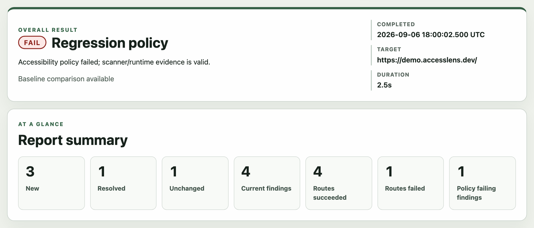
One media frame supports two kinds of evidence. Illustrative compositions keep an overlaid label so they are clearly presented as diagrams; real screenshots use the same frame with a caption below the image, keeping product evidence readable without implying that it is an illustration.
CTA & link grammar
Five kinds, each with one job and one position. Nothing floats in whitespace; every one is anchored to the thing it belongs to. The forward arrow is a single shared.cta-arrow element: it nudges 3px toward the destination on hover and keyboard focus, and holds still under reduced motion.
- Card-owned CTA
.cta-ownedBelongs to one card or block. Right-aligns to that block’s edge; reverts to the left below 40rem.
In production: ProjectCard, the flagship and professional cards, the homepage OS teaser
- Section-level CTA
.cta-sectionBelongs to a section. Sits at the section’s content origin, never floating in whitespace. Grey at rest, primary on hover.
In production: “See all work”, “Visit Creator / Personal” on the homepage
- Back / context link
.back-linkPlain text link that follows the reading column back up one level.
In production: “Back to Work” on every case study
- Cross-page prev / next
CrossSectionNavPaired navigation: previous points and aligns left, next points and aligns right. Bidirectional arrows.
In production: the footer of /work, /creator, /personal and the case studies
- Inline contextual link
a (in prose)Stays inline in a sentence, underlined. Never promoted to a button or given an arrow.
In production: body copy across the case studies
Type & semantic tokens
Core scale: the reading hierarchy
- Prateek Arora
- Section heading
- A supporting subheading
- The opening line of a section, one size up from body.
- Primary reading size for long-form paragraphs and case-study copy.
- The secondary body size, used for supporting copy and dense UI text.
Utility roles: labels, never a hierarchy level
- Section kicker
- Caption / metadata
The homepage name and each identity’s editorial h1 are the only sanctioned bespokeclamp() sizes; check:tokens fails any other off-scalefont-size.
Spacing, as it is actually consumed
The full primitive spacing scale (reference)
--space-0--space-1--space-2--space-3--space-4--space-5--space-6--space-7--space-8--space-10--space-12--space-14--space-16--space-18--space-20--space-22--space-24--space-28--space-32--space-36
Radius & elevation
--surface-raisedflat, no shadow--shadow-glassthe dock, popovers--shadow-elevatedcards, the unlock dialogThe cards sit on a lighter tonal surface so the two production shadows are actually visible; the values are unchanged. Cards bind --card-radius to --radius-lg; controls (buttons, badges, the dock) bind --control-radius to--radius-full. The glass material is a separate concern, inThemes & materials.
Accessibility: contrast inspector
Not a generic contrast calculator. This one resolves the live tokens under a theme scope, and it composites translucent tokens over a defined backdrop before measuring, so a hairline or the glass tint returns a real number, not an impossible one.
-- : 1
axe-core (serious / critical) is a build gate on /,/work, /work/prateek-os, /work/design-system,/creator, /personal, and the protected-route lock. Reduced motion, focus visibility over translucent surfaces, and the button-group keyboard contract are covered too.
Inspectable depth
Three interactive demos below. Each is wired to real production values; none of it is required to follow the argument above.
Motion
Every swatch moves the same object the same distance with the same easing (--ease-out-quad), so pressing play separates them purely by duration. The easing curves are compared underneath at one fixed duration.
Same 640ms, two easing curves
--ease-out-quad--ease-out-expoUnder prefers-reduced-motion: reduce, global.css collapses every transition and animation site-wide to 0.001ms. The play button still resolves the end state instantly; nothing here behaves differently in kind, only in duration.
Interactive sandbox
Adjust the semantic tokens and watch the change propagate through a small composition. Scoped to this box only; nothing here touches :root or persists after you leave.
Composition
Semantic propagation
Heading, body, card, badge, link and border all read the sandbox tokens.
Against the production rules
- Body text contrast
- Radius
- Accent
Responsive, for real
The live /work page rendered at three real viewport sizes and scaled to fit, never clipped or reflowed. Real breakpoints: the rail becomes a strip, the card grid stacks, the type re-fluids. Deferred until you load it so it never slows this page.
The system, enforced
The rules on this page are not aspirational. 10 automated checks run before any change ships, and this page is built entirely from the production tokens and components, so a regression here is a regression you can see.
The 10 gates
pnpm checkastro check / tsc, across .astro, .ts, .tsxpnpm lintESLintpnpm lint:cssStylelint, no raw colour literal in a style blockpnpm check:tokensNode audit: no raw hex/rgb/hsl or off-scale font-size outside the token layerpnpm check:copyno em/en dashes in visitor copy; advisory AI-cadence listpnpm format:checkPrettierpnpm testVitest unit suite (includes the contrast math on this page)pnpm test:e2ePlaywright, Chromium plus mobile Chromiumpnpm buildAstro / Cloudflare adapter production buildgit diff --checkno whitespace errors
Built with
- Astro
- TypeScript
- CSS custom properties
- Stylelint
- React
A three-layer token system, four theme scopes over one semantic layer, and a build that refuses a stray hex. A portfolio built the way a system is built.